Commercial Project Highlight: CubeSmart for ARCO/Murray

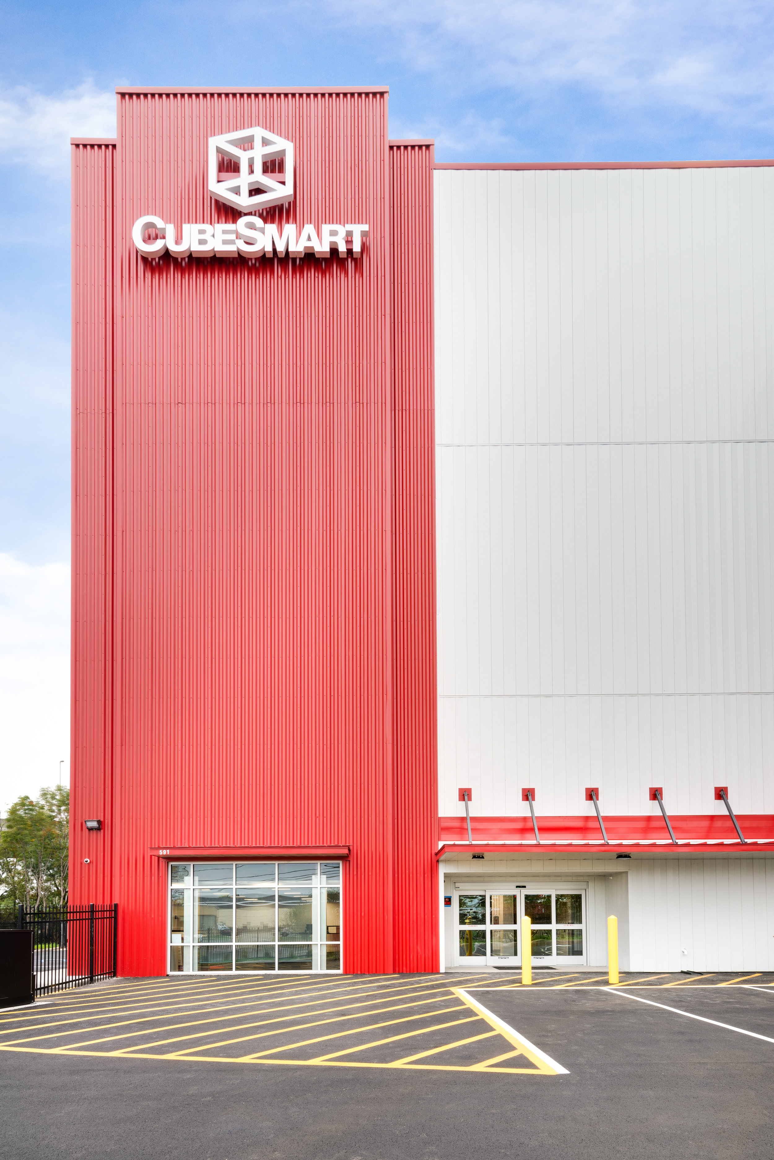
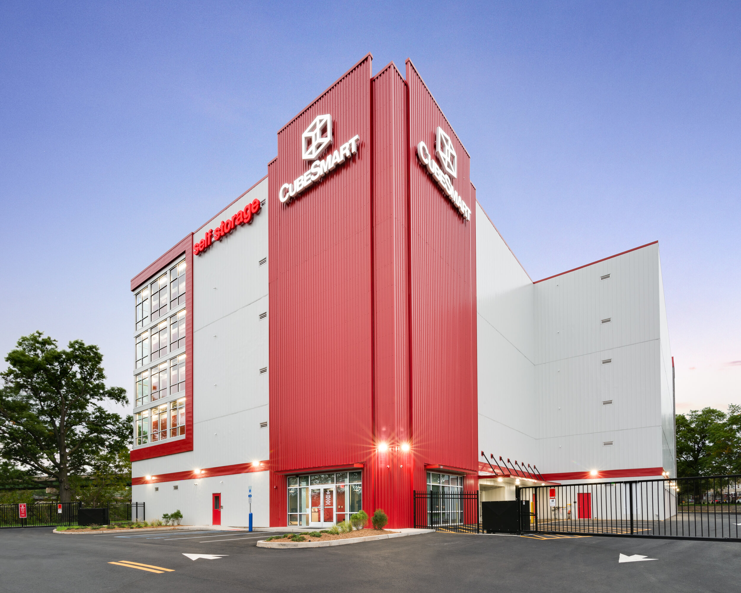
Self storage facilities are, for the most part, big windowless boxes. So I was really glad when my client, national design/build firm ARCO/Murray, wanted twilight photographs included for this shoot. That is always a good way to make a big windowless box more visually appealing. The red pops nicely too. Here are a few of my favorite images from this project.

HillsideCubeSmart_MCacioppo_001.jpg

A second option I provided them on the same image - adding a sense of motion to the image with car headlights passing in the foreground.

HillsideCubeSmart_MCacioppo_002.jpg
HillsideCubeSmart_MCacioppo_005.jpg
HillsideCubeSmart_MCacioppo_004.jpg
HillsideCubeSmart_MCacioppo_003.jpg


Real Estate Photography: Using Editorial Style Photographs to Market a Property.

Welcome to the first post in a new series focused specifically on real estate photography (and video)! In this series I’ll be covering everything from preparing a space for a photo shoot, some technical and behind the scenes stuff, as well as ways to get your properties to stand out in an often crowded market. So let’s get started.

Using Editorial Style Photographs to Market a NJ/NYC Area Property

Mix of natural light and strobe, interior lights off, tighter shot. Obviously, its All about the view Here.

Mix of natural light and strobe, interior lights off, tighter shot. Obviously, its All about the view Here.

If you’ve spent a lot of time scrolling through listings recently, you might start to notice a trend. Super wide shots taken from the farthest distance possible, at an angle. The idea being make the rooms look as big as possible, but often these images look a bit distorted and unnatural. When potential buyers show up, they might be thinking “this place looked a lot bigger in the pictures,” even if they are in a pretty large home. Here’s the thing. How often does anyone stand at the farthest corner of a room? Could it be more appealing if the viewer was getting a more realistic sense of the space?

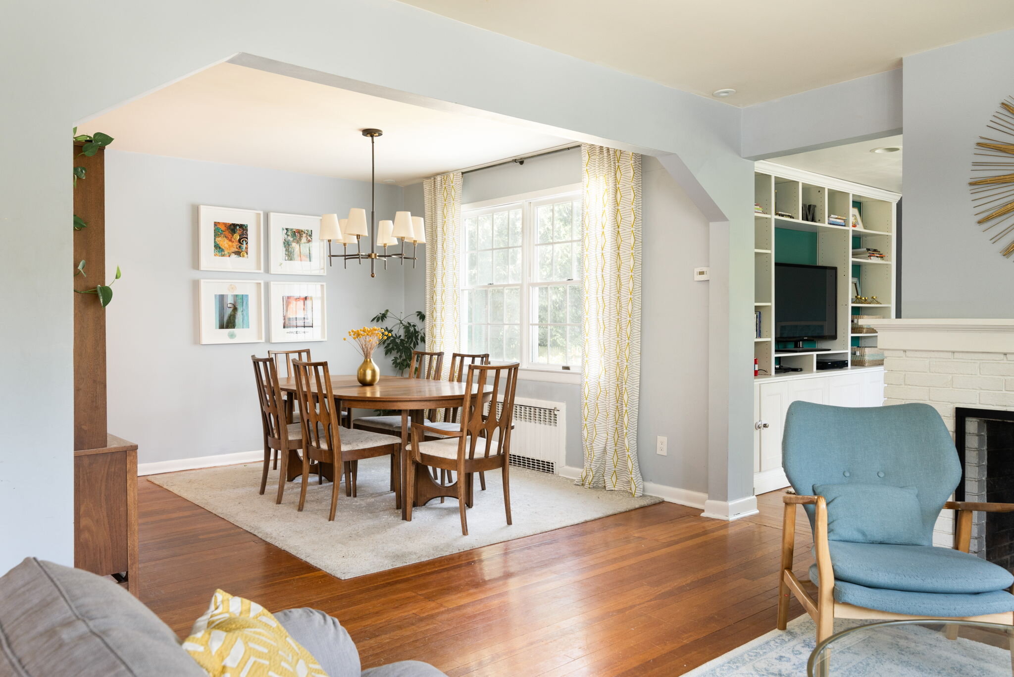
What I like most about this image: Gives the viewer a good sense of the flow between rooms.

What I like most about this image: Gives the viewer a good sense of the flow between rooms.

So what do I mean by editorial style? If you flip through the pages of just about any design magazine (or scroll through their Instagram feed), you’ll see tighter shots and more use of natural light. If off camera lighting is used, it is usually undetectable (thats a good thing!), and most of the time the interior lights will be off. You’ll also see a lot more one point perspective shots, sometimes referred to as ‘straight on.’

One point perspective kitchen shot.

One point perspective kitchen shot.

Using editorial style photos for listings has started to become popular just across the Hudson, in the New York City real estate market, but you don’t have to be listing a 15 million dollar penthouse to use some editorial style photographs for your marketing. Adding even just a handful of these shots could help your listings stand out and attract more clients. They are especially good for sharing on social media.

Interior lights off - this home had fantastic natural light.

Interior lights off - this home had fantastic natural light.

You might be thinking, these are nice and all, but you can’t see the entire room, and we need to see the entire room. I agree, and luckily there are ways to show an entire space without things looking super wide, distorted and unnatural. Having the camera at the right place, and the right height, is important.

What i like most about this image: shows the entire space without an awkward angle.

What i like most about this image: shows the entire space without an awkward angle.

Take the image above for example. I could have stood in the corner to the right and shown even more of the wall to the left, but the angle would have distorted the table, making it appear really large, and it would eat up a lot of the visual space in the foreground of the image. With this shot, you can see how large the kitchen is while still getting a realistic sense of what it might be like to walk through these rooms.

One of my favorites: the moody afternoon light in this image gives the viewer a sense of the character of this beautiful home in short hills, nj.

One of my favorites: the moody afternoon light in this image gives the viewer a sense of the character of this beautiful home in short hills, nj.

Real estate shoot meets design shoot.

Every photo I’ve posted here was taken at a listing shoot. Don’t worry, I’ll get those wider shots, but I love getting the ones that really show more of the personality of a home. And often, I’ll see them being used as a lead image in the listing or Instagram post.

Interested in working together? Let’s discuss how great photography can help set your listings apart and better define your brand a a real estate professional. Photo and video services for real estate are currently available in NYC, Jersey City, Hoboken, Hudson, Essex, Bergen, Union, and Counties. For neighboring counties, availability varies, please inquire.

The Gray Barn at Woodstock Sanctuary

Following up on my earlier post highlighting some recent press from The Gray Barn of my favorite images from this project, designed by Marica McKeel, Studio MM Architect.

Incredible views from every room, but the most impressive has to be from the main living area through these gorgeous floor to ceiling windows.

Incredible views from every room, but the most impressive has to be from the main living area through these gorgeous floor to ceiling windows.

Same view at dusk.

Same view at dusk.

Spacious open kitchen.

Spacious open kitchen.

Kitchen detail, love the black and white counter tops.

Kitchen detail, love the black and white counter tops.

GrayBarnMCacioppo002.jpg
DSC_5215-Edit.jpg
MCacioppoGreyBarn006.jpg
GrayBarn_MCAP049.jpg
GrayBarn_MCAP001.jpg
Photo of Sanctuary resident Caesar by Samantha Fisher.

Photo of Sanctuary resident Caesar by Samantha Fisher.

DSC_5072-Edit.jpg
From the deck at twilight.

From the deck at twilight.

GrayBarn_MCAP044_2.jpg

When you stay at The Gray Barn you are directly helping to support the work done by the folks at Woodstock Sanctuary. I had the privilege of spending a couple nights there when I was taking these photos. The space itself has a very relaxing vibe thanks to the open, minimal design and generous amounts of natural light in every room. And you might even spot some cute rescued goats in the field just below the deck!

Recent Press - The Gray Barn Inn at Woodstock Sanctuary

I recently had the privilege of photographing a gorgeous new bed and breakfast right outside of New Paltz, NY. The Gray Barn is the new B&B at Woodstock Farm Sanctuary, the 150 acre home to over 200 rescued animals in the Catskills. Guests there get a delicious vegan breakfast and the opportunity to volunteer and take farm tours all year round. The Gray Barn was designed by New York based architect Marica McKeel. Every room has an en suite bathroom, fantastic natural light, and a gorgeous view of some of the sanctuary’s property. If you stay there, you will almost defiantly see some adorable goats in a nearby field from your window.

Check out two recent articles from Hudson Valley publications below.

Click the image to read the Chronogram article and see more photos.

Click the image to read the Chronogram article and see more photos.

Click image to read the Upstater article and see more photos.

Click image to read the Upstater article and see more photos.